The objective of my spoof ad campaign was to create a phony, new product from Blackberry that riffs on the poor battery life of Blackberry phones - hence the name LackBattery. My plan was to create a product that was an obviously poor construction of two phones that were slapped together, literally. This would then convey the idea of double the phone, and in turn, double the battery life. I decided to call it the AM/PM Dual Package, and strung together two Blackberries with many rubberbands. This meant that instead of recharging the phone when it dies halfway through the day, one can simply power up the other. I created two different ads, using original photography, photo editing and other effects in Photoshop, and Typography in Illustrator. The second of the two is more so the b-side, or rejected ad, (though I'm still proud of it) and the first ad is the final. You'll notice I chose two different type families in order to fit the aesthetics of each ad. While it would've been great to maintain a series, the incompatibility of the second ad with the first ad's font made it become the b-side ad, in my eyes. Plus, something about the first is just much stronger. Maybe I will revisit them in the future.
#1 (Final Version)
#2 (B-Side)
The demographic that I chose to target with this campaign is young adults/young professionals/20 somethings in the business world. This is because they have very busy schedules, especially those who have began their own business, and they need reliable battery life in their phone, along with the current attributes of Blackberry phones that make them great for business. That is why I chose to place my ad in Entrepreneur magazine. Their Facebook page explains what they are about through the following, brief company overview:
Entrepreneur magazine seeks to inspire, inform and celebrate entrepreneurs. We offer real solutions to the challenges you face as an entrepreneur, including tips, tools and insider news to help build – and grow – your business.Not only did I place my ad in their magazine, but I made my second form of advertisement an introductory pop-up ad on their site home page. The latter was inspired by the quick pop-up advertisement which is located on their site when it has been opened in a new window.
Businessmen/women are often very straight-to-the-point individuals because their lifestyle is very fast-paced. That is why I went for minimal text, just a simple tagline, logo, and creative photo. These people want their information, and the want it quick, which is why I feel the layout is perfect. Also, based on the Adbusters.com research about visuals in ads, I feel like my photography is intriguing enough to draw someone in. Once I have them they'll have to read the tagline.
Online Pop-Up Ad - Entrepreneur.com
One last point I would like to touch on is the alteration of the logo, and the simplicity of my signature on the ad. Within the Blackberry berry icon I designed it to instead have a crescent moon on the upper left and a rising sun on the lower right. This indicates the product as the "AM/PM" Dual Package, as well as maintains the relation of the product to other phones within the line (assuming I created others). I received a lot of feedback in class about the logo (since I had many options), and some people really thought that I should keep it as LackBerry; however, I chose to make it LackBattery in my final because I really wanted to maintain that instant focus on the poor battery life. I felt like if I had kept the earlier version I would have compromised some of that spark. I did slightly enlarge the "L" based on feedback, though. The signature is simple in order to provoke viewers to search it online for more information, which will lead them to more beneficial attributes.
Final Logo
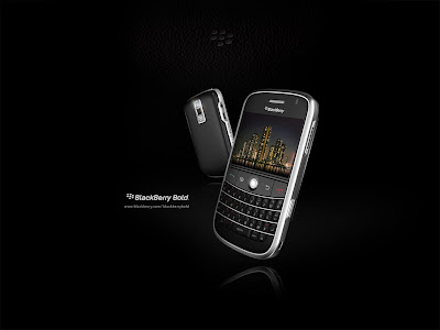
I hope you enjoy all of the elements and hard work that went into creating this project. I spent a lot of time perfecting it, and had fun doing so. To close, you can find some actual Blackberry ads from which I drew some inspiration.


No comments:
Post a Comment