The advertisement that interested me the most was the Pfizer Animal Health ad that featured a cat stuffed into an overly small cage with minimal text. I found it to be very effective because of the striking image and the simple text: it made me want to find out more right away. Additionally, the use of humor was very effective; a common trend from the Internet is to poke fun at cats in awkward situations; this advertisement follows that trend and attracts attention there as well.

The advertisement I chose to relate to the chosen image is this image by the WWF that aims to promote recycling in order to save the environment. Like Pfizer Animal Health's advertisement about vaccines for cats, this advertisement features a large, striking photograph with very minimal text. The point in particular that I'd like to make about this image is that even though it's not in English, the goal is clear as day: immediately one knows that the goal is to save the animals in our environment, and they are being harmed by our littering.
Chapter 2
Chick-Fil-A's "Eat More Chikin" campaign uses humor in order to guide the audience towards not eating beef as well as consuming more of their product. The advertisements use pity on cows to detract away from their consumption, but makes certain to keep the tone light so as not to infringe upon PETA's seriousness in the matter. It makes for an effective campaign because the humor is thought-provoking, and one could almost think of the cows as friends rather than food.

A similar tact is taken with the Real California Cheese ad campaign: the commercials feature happy, humorous cows; they emphasize that the product is made with only the happiest cows in mind. Once again, the focus is on the best possible well-being of cows, but while keeping the tone light so as not to alienate the audience or otherwise make them feel guilty for consuming non-California cheese. There isn't too wide of a margin in terms of difference in tone between the two ads; their strength lies in their friendly tones and "earth-positive" ideals.
Chapter 3
The set of advertisements I found to be the most intriguing are the print ads from Levis that hold onto the concept of "Shrink to Fit" for their Shrink to Fit line of jeans. I felt the graphic composition of these ads was very interesting--like the images from Chapter One, the large, detailed photograph draws the eye in, and immediately generates interest. However, with this set of ads a large section of bolded text is needed to properly get the point across; it adds a sense of urgency to each of the images.
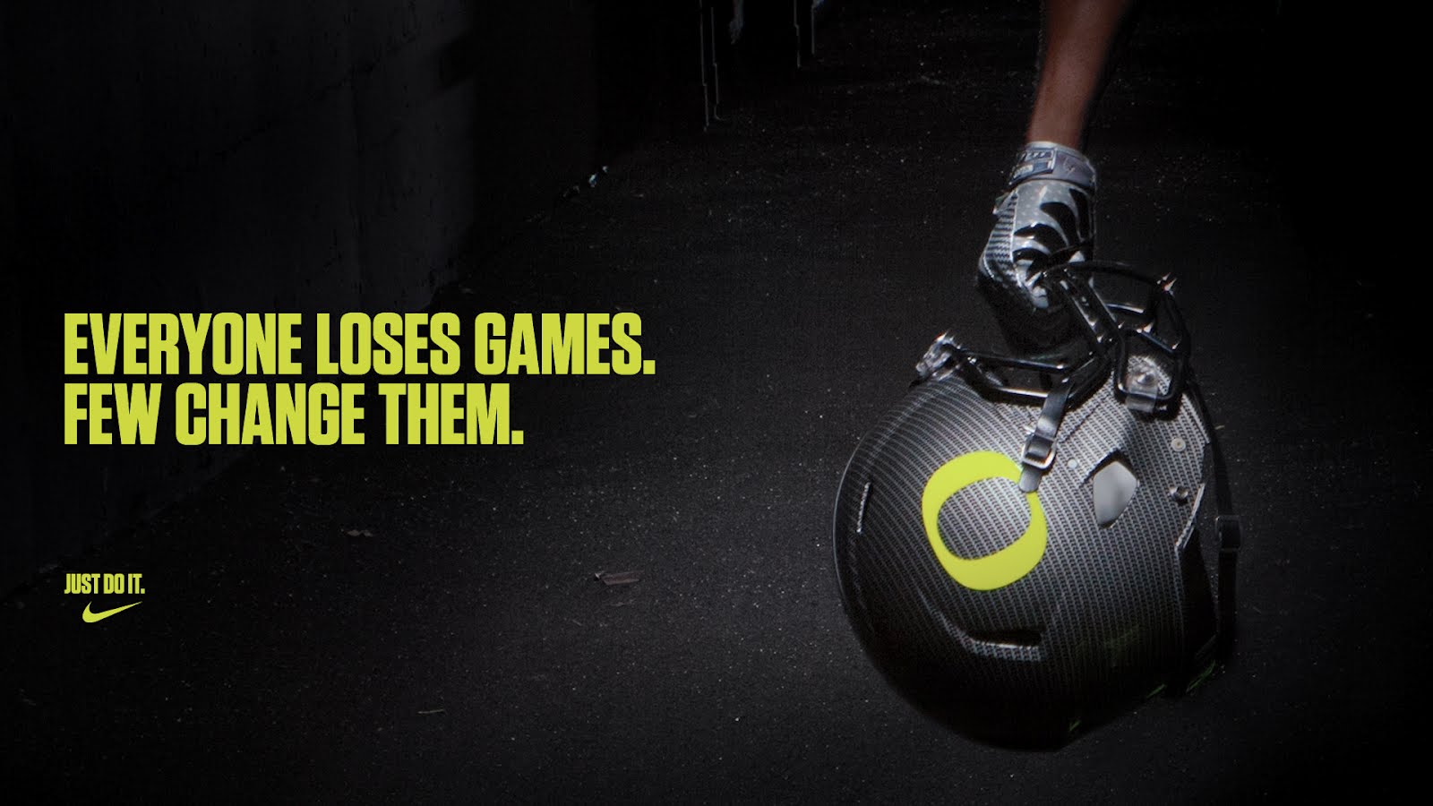
The Levis advertisements immediately reminded me of the high-contrasted advertisements by Nike; the general advertisement design looked to be created by someone of the same mind-set. I feel that using this general format for ads is very effective, because we are naturally drawn in to a highly graphic image with a lack of text due to simple readability.
Chapter 4The most effective of the ads shown in Chapter Four is the "Elf Yourself" campaign, because it directly inputs the audience into the product and engages them immediately. I thought it was a very interesting way to draw people in, because it encourages them to 'play' with the product: and with any interaction builds chances for sales or otherwise attention towards the product, making for a successful advertisement.
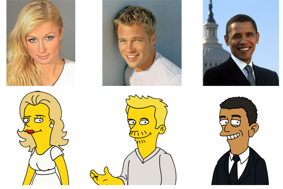
A similar campaign that I find to be equally (if not more) effective is The Simpsons' "Simpsonize Me" campaign: as soon as it came out in order to promote The Simpson Movie, it seemed as if half of my Facebook friend list had gone and 'Simpsonized' themselves, even if just out of curiosity--as far as I knew, they had no interest in the show! Pulling in the audience and inviting them to 'play' is perhaps the ultimate in effective advertising.
No comments:
Post a Comment