
I chose this ad from speakuporelse.com. I was drawn to this ad while reading because it is so in your face about its message that it's hard not to notice it. I feel like it is a bit intense for an advertisement, but overall I like it.

I chose to compare the speak up advertisement to any of Peta's ads. I feel like they are similar because of their "in-your-face-ness" and because they are effective, but in a blunt and sometimes harsh way.
Chapter 2

I chose the Chick-fil-a "Eat More Chikin" advertisement from Chapter 2. I think this advertisement is effective because it really caught my eye while reading the chapter, and also I found myself looking at it longer in order to read the whole message and notice that the painters are actually cows.

In comparison to the Chik-fil-a ad, I chose this series of ads for jobsintown.de which feature illusions of people working inside of all of the sources of entertainment. I think both ads are effective because they catch your eye, you find yourself looking at them longer to see everything and really understand, and they are both very clever and quite funny.
Chapter 3

I chose the Levi's ad from chapter 3. I chose this ad mostly because it was so interesting looking. I guess overall I don't really get the point of the ad, but the enormous changing in scale between the foot and the guy who is laying down is so crazy, you can't help but notice the ad.

I chose another jean company to compare to the levi's advertisement. I feel that both the Levi's and the Diesel ads are effective in their own ways. The Levi's ad as I mentioned above draws you in with the scale change, this diesel ad however draws you in with a simpler photograph and large bold typography.
Chapter 4
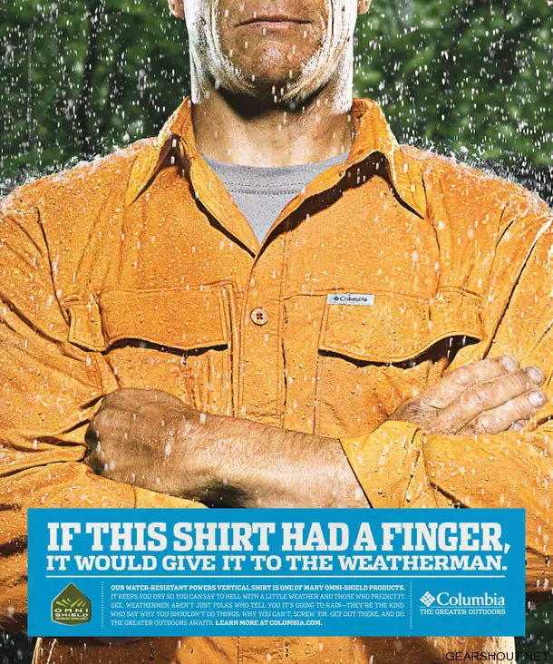
I chose the Columbia clothing ad for Chapter 4. I feel that it is effective because of it's wit and humor in the copy. It also catches your eye by slightly personifying the item of clothing.

I chose the DePaul "this is not a..." ad campaign for comparison. I feel that these ads that we see around our campus also draw you in with their copy and interesting ideas.
Chapter 7
I didn't have a scanner available to me and wasn't able to find the image on the web, but for chapter 7 I chose the advertisements for The Nature Conservancy featured on page 113 of our book. I thought these ads were really innovative in combining these photos from the past and photos from present day to show that they will continue to preserve these natural areas.
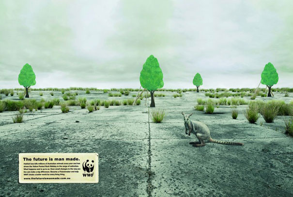
To compare I chose the above advertisement from the World Wildlife Fund. I think this ad is also effective by combining to different times (in the WWF ad it is supposed to be present day and the future if we continue to destroy animal sanctuaries versus the past and the present in the NC ad) but I think both use this idea and theme effectively.
Chapter 8

I thought this ad for the bike helmet from Chapter 8 was fantastic. I love that they only used their own product to create the design. I think this is really effective because it might take someone a few minutes to realize what they've done, but when they do there is that "aha" moment when it sets in and this whole process makes you look at the ad longer and you will probably remember it.

I thought this series of ads from Faber Castell compared nicely with the bike helmet ad. Both feature the company's product creating part of something else and they make you think and definitely make you remember the ads.
Chapter 9

I thought this Volkswagen advertisement from Chapter 9 was really effective. I think the idea that they used where even the wedding photographer is distracted by the "surprisingly ordinary prices" is clever and entertaining.

This ad for smart cars is quite clever as well, showing that their cars use less gas than other brands.
No comments:
Post a Comment