Thursday, May 31, 2012

Ally Geoffrey Chapter 13-15

Chapter 13
The website that stuck out the most in Chapter 13 was the Nokia Urbanista Diaries. Nokia has a website, a mobile application, and personal widgets that allow people to capture and share their lives through pictures with the Nokia N82. I think this campaign is very creative and by making it interactive insures that Nokia will have returning users and a great way to spread the word about Nokia's new product. A similar website is Fire Eagle. Fire Eagle is a site that stores information about your location. With your permission, other services and devices can either update that information or access it. You can share your locations with friends on Facebook as well as find your friends and post short messages, tips, and invitations. Fire Eagle isn't selling a product but I think it uses similar interactions as Nokia. 
Chapter 14
The Go Daddy app helps its target create the perfect plan. The app is simple and allows users to pick certain criteria for their plan. An app I often use is similar to Go Daddy is Localscope. Hands down my favorite app for finding anything around me. Besides the top notch user experience and all the other great features seamlessly packed into this wonderful app, the key reason that this app remains my number 1 is that Localscope is the only app out there that lets you search for the same query using multiple search sources, without having to retype the query again and again. Twitter is the best place to look for public opinions about a place. Localscope lets me search for one search phrase across all of these services, and I have to type the phrase only once. Almost everyone has a smart phone these days and it's important for mobile apps to be quick and simple because people use them on the go and want results fast. 


Chapter 15
The Design A Coach Tote was a fun way for Coach to connect with a younger audience across the Internet. The campaign built a relationship with consumers by having them like, post, vote, and share design ideas. I think campaigns that get their consumers involved and spark their interest are  the most successful. An unconventional campaign that comes to mind is how Bing teamed up with Jay-Z on Google to launch his new book. The book which was called Decode was seeded out in to the real world one page at a time in a number of innovative ways including on billboards, on the bottom of swimming pools and even wrapped on a car. Fans were able to track down the new pages in the book using Bing maps and clues left within Bing search engines and social media sites like Twitter and Facebook. The promotion helped the book to hit the best sellers list for 19 straight weeks and the campaign had widespread coverage across blogs and traditional media.


Wednesday, May 30, 2012

Kathie Trela - Chapters 13, 14, 15

Chapter 13

I am going to comment about the website made for Lands' End called Packland. I think this webpage is perfect for young kids. they can design their backpack and add unique backgrounds and theme. They can additionally add items to their backpack. Everyone likes to customize stuff especially children and they use backpacks everyday. It is a good marketing tool. Kids can share their Packland creation on the web to let others know about this website. The only drawback is that you can't order your custom backpack. For example, I have been dreaming of ordering custom Nike kicks (They are about $120 - need a job first).  The site is called NikeID and here you can select a specific Nike shoe and customize it with colors and adding a custom id to the shoe to make it only yours. Here you also can share it with friends by adding a background and a caption. The site is easy to use because it goes step by step. At the end, you can order your shoes and get it in the mail!  You can additionally look at other people's creations, rate them, and even order them. I know I would pay the hundred something dollars to get custom Nike's.


Chapter 14

I never knew about the site UrbanDaddy, but I think it is good that they created a phone app for their site because nowadays everybody is on the go and not everybody carries a laptop with them. From the screenshots of the Urban Daddy app, I can see that it is simple and easy to navigate. I think those two aspects are the most important because people will use your app again if it's easy and appealing. Mobile apps are great tools for current users of your site and great to get new users because everybody has a phone. Maybe not a smartphone, but maybe this will push them to get a smartphone. In another light, it is also advertising for smartphones that can hold apps because life will be so much easier if you have a smartphone. StubHub also made an app for their site. You can sell and buy event tickets and now you can buy and sell tickets on the go. You probably can buy tickets hours before the event. Phone apps make life a piece of cake. It sucks that I do not have a smartphone, but I can dream. 


Chapter 15

I am going to comment about the Social Media Campaign for Coach which was "Design A Coach Tote" competition. The competition let anyone submit a bag design and the most voted bag would be actually be designed on the bag and sold. I think this is a very effective campaign because first of all, it is interactive. I think they are many people that would love their design to be on a designer handbag. I believe social media campaigns with contests are the most effective because people love to win or even have the slightest chance to win anything. This campaign made people excited about the brand and was linked to many blogs and social media; therefore, the word was out there. Everyone was talking about Coach and there were more than 6 million engagements with this campaign. That is very successful. H&M also has a social media campaign with a competition, but it is different. Here you can win to be a H&M trend scout in Denmark. You post a photo of yourself and your style icon and trends that you like. People vote for you and a most voted wins. This competition does not directly affect H&M products, but it lets fellow customers share their fashion styles and favorite trends that are sold at H&M.


Tuesday, May 29, 2012

Marie Dolby -- Ads of Interest


Trends in fashion and makeup always recycle.  I love ads that were drawn from the 20's and 30's.  I want to create an ad that is new, but old at the same time.

Ally Geoffrey's My LIfe in Advertising Ideas


All my life I have been a dancer and want to incorporate it into my final project since it is something I am passionate about. After doing the in class exercise, I realized I use a ton of personal toiletry products like face wash, deodorant, and shaving cream. I am a sweaty person in general but after dancing for hours or competing at an all star level, I am drenched. I’ve always used Secret Scent Expressions Deodorant and keep extras in my gym and dance bag. For my final project, I am thinking about doing an advertisement for Secret and incorporate my passion for dance within in. I have posted a few images of dance photography but will probably take my own. I’ve also posted some Secret ads so you can get a feel for the content and layout of the ads and what I’m going for. 


"You know you're dancing when tears of pain and happiness blend in with your sweat."

LENCKUS My LIfe in Advertising

I am a very inspired person, typically from sources of art, fashion, and photography. Being a photographer, I feel that with the right intention, all photos (or atleast the ones that I take) can be made into advertisements. I seek out photos as a way to tell a story, and to emulate messages for a specific target audience. There is little that I just "shoot to make a shot", but rather, I try to combine all the technical elements along with a message strategy in order to make a photograph worth while.

I my life in advertising, I want to make my photographs come to life through explaining the products and lifestyle that I live every day. I recently have done an analysis for another class on hip-hop in advertising, and I found it extremely relevant to this topic. Although I am not cultured in the hip-hop world, the use of hip-hop as a tool for marketers has changed society and advertising.

My inspirations and interests come from things being of INTENSE means. I like strong messages, bright colors, loud music, and fast-pace lifestyle. I find myself always being busy, pushing for the 'and beyond...', and living life for the moment. Edgy and proud, my style is usually that of which people want to get to know, engage, and most of all, question.

For this campaign, I want to use a little bit of humor, since I have always been a sarcastic person, out to make as many people laugh and smile as possible. I have been in this habit of saying, "WHO ARE YOU" as a joke to usually point-out unordinary people or attitudes. haha. So with this, I want to take that sadistic tone of trying to rudely question someone's quirky or unusual disposition, which I feel I have myself.

The design I want to approach would be that of a very edgy, modern, neon-colored presentation. IKEA and mockingly creative ads have struck my interest in the approach I am trying to emulate.

Advertising: IKEA
Artist: Rothko


Artist: James Rosenquist

DALEK Graffiti artist


LOMOGRAPHY photography (marketing strategies on this are HUGE, which I love! :)


Eric Montanez - My Life In Advertising [Draft One]


Wardlaw Life in Ads

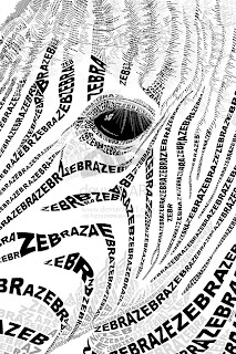
For my Life in Advertising project, I want to recreate myself and my desk, where I work, using typography. There are some examples below of what I mean. I actively use many different brands every day and think it would be cool to recreate an image of my workspace using only the names of the individual brands. In several of the images below (hand, skeleton, flower) the different parts of the image are created using the word/s that describe that section of the image. My image would simply be made up of words like iMac, Magic Trackpad, Wacom, M-Audio, Clif, Kingston, Post-it, Patagonia, Levi's, Simple Shoes, Hanes, etc. That's just what is on my desk right now.

Some inspiration:


Callebert- My Life in Advertising Slogans

Katie Callebert

One of the first things that I remember from my childhood was this old tin Saltine Cracker container. My grandma had one exactly like it and she would keep Salerno cookies in it. I was always drawn to the container and the old fashioned style.


When I was younger I was always loved bright colored Disney advertisements. 

This is a current Disney ad but you can see the old fashioned influence.


I also am drawn to witty and clever ads like this Heinz ad.


I am thinking about either focusing on all Disney and/or  a progression from old fashioned ads to current but old fashioned inspired ads.

Kathie Trela - My Life in Advertising Idea

I love cheap fashion and I love when there are ads for clothing that are simple and actually show the whole outfit. Much of my closet is occupied by Forever 21 and H&M clothing. Here are some simple ads for them.


I still have no concrete idea. I also like Art Deco style fashion ads and posters. Maybe making a Art Deco fashion ad for myself? I am still not sure.


This one is my favorite.